If you're an electrician offering 24/7 callouts, your website has one job: turn a stressed visitor into a phone call within seconds. Most tradesperson sites quietly fail at this, even when they look smart on a laptop.
In this guide you'll find exactly what an emergency-focused page needs, in what order, and why each element matters from the perspective of the person on the other end of that 11pm Google search.
By the end, you'll be able to look at your own site and spot exactly what's costing you calls. No jargon, no fluff, just the practical anatomy of a page built to convert panic into bookings.
Why Emergency Electrician Websites Need a Completely Different Playbook
There's a huge gap between someone casually researching a kitchen rewire and someone staring at a smoking socket. The first person is happy to browse three or four sites, read your About page, and request a quote. The second person has roughly ten seconds of patience before they tap back to Google.
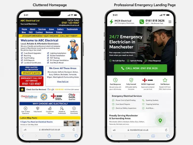
The standard tradesperson template (About / Services / Gallery / Contact) was built for the first type of customer. For emergencies, it's a disaster. By the time a panicked homeowner has scrolled past your van photos and company history, they've already called your competitor.
Here's the rough difference in numbers. A generic homepage might convert around 1.5% of emergency visitors into calls. A dedicated emergency landing page, built properly, regularly hits 8 to 12%. Same traffic, five to eight times more phone ringing. That's the gap we're closing.
The Mindset of Someone Searching "Emergency Electrician Near Me" at 10pm
Picture this. It's Sunday night. Sarah is making tea when the kitchen lights pop and the fuse box starts buzzing. The kids are upstairs, her partner is away, and she can hear something faintly clicking near the consumer unit. She grabs her phone, the only light in the room, and types "emergency electrician near me" into Google.
She isn't comparing five tradespeople. She isn't reading your About page. She's scared, she's on mobile, and she's looking for two things in the first three seconds: a phone number and a reason to trust that the person who picks up will actually come out.
That's your real customer for this page. Not a researcher, not a comparison shopper, but someone who needs reassurance and a tap-to-call button. Every design decision on the page should be tested against one question: would Sarah call within ten seconds of landing here?
The 7 Non-Negotiable Elements of a High-Converting Emergency Electrician Landing Page
Once you understand Sarah, the page almost designs itself. There are seven elements that consistently turn emergency traffic into phone calls, and the order matters as much as the elements themselves.
The flow looks like this, from top to bottom: hero section, trust strip, click-to-call button, service areas, reviews, a "what happens when you call" section, and a sticky mobile call bar that follows the visitor everywhere.
Let's go through each one.
A Hero Section That Answers "Can You Help Me Right Now?" in One Glance
The top of your page has one job: answer the question "can you help me, here, right now?" before the visitor scrolls.
A weak hero looks like this: "Welcome to Smith Electrical, your local family-run electrical contractor since 1998."
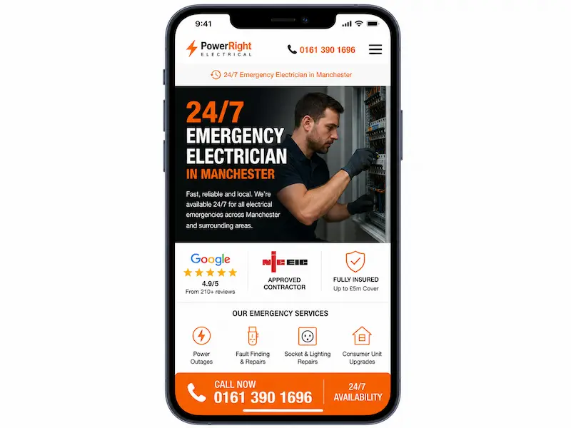
A strong hero looks like this: "Power Out in Manchester? Call Now. Engineer With You in Under 60 Minutes." Underneath that headline, you put your phone number in a large, tappable format, a one-line response-time promise, and your NICEIC or NAPIT badge.
That's it. No carousel, no stock photo of a smiling family, no welcome paragraph. The headline does the work. Use the town name, the service, and a clear time promise.
A Click-to-Call Button That's Impossible to Miss
On mobile, your call button is your conversion mechanism. Forget contact forms for a moment. People in an emergency want to hear a human voice.
The button must be a proper tel: link so a single tap dials the number. Place one in the hero, one mid-page, and one in a sticky bar at the bottom. Make it chunky, high-contrast (orange or green works well against most colour schemes), and keep the copy direct: "Call Now: 24/7" beats "Get In Touch" every time.
There's no such thing as too many call buttons on an emergency page, as long as the page doesn't feel cluttered. Three to four is normal. The thumb should always be within reach of one.
Instant Trust Signals (Because They've Never Heard of You)
Sarah has never heard of you. She's about to invite a stranger into her home at 10pm. Trust signals are what move her from "this could be a dodgy site" to "yes, I'll call them."
Stack your credentials visibly: NICEIC or NAPIT approval, Part P registration, public liability cover (£2m or £5m), years in business, and your company registration number in the footer. Add real photos of the engineer and the van, not stock images. If you have a Checkatrade or Trustpilot widget, embed it.
A trust strip just under the hero is incredibly effective. Something like: "✓ NICEIC Approved ✓ £5m Public Liability ✓ Over 1,200 Local Jobs Completed ✓ DBS-Checked Engineers." Five seconds of reading, instant credibility.
Clear Service Areas So Locals Know You'll Actually Come Out
One of the biggest hesitations on an emergency page is "yes but will they actually come to my postcode?" Answer that question before they have to ask.
List specific towns and postcode areas. Embed a small Google Map showing your coverage radius. Avoid the temptation to claim you cover "the whole UK" or "anywhere within 50 miles." It looks vague and untrustworthy.
Something like this works beautifully: "We cover Romford, Brentwood, Billericay, Chelmsford and surrounding CM and RM postcodes. Engineer typically are on site within 45 minutes." This also gives Google clear local signals, which helps your page show up for nearby searches. For more on this, ranking locally on Google takes more than just a landing page.
Reviews That Sound Like Real People, Not Marketing Copy
Generic reviews kill conversions. "Great service, thanks!" tells Sarah nothing. The reviews that work are the ones that mirror her exact situation.
Pull reviews from your Google Business Profile and feature the ones that mention emergencies, speed, and a real outcome. Include a first name and town for authenticity. Display your overall star rating and total review count near the top of the section.
Compare these two:
Weak: "Great service, would recommend."
Strong: "Called at 9pm on a Sunday. Dave was at our flat in Ilford within 40 minutes and fixed the fuse box. Total lifesaver. Priya, Ilford."
The second one does the selling for you. Three or four of those, well chosen, beat a wall of fifty generic ones.
A "What Happens When You Call" Section to Remove Hesitation
A lot of people hesitate to call because they're worried about the cost or about wasting your time. A simple three-step explainer removes that friction.
Use a clean visual: "1. You call. 2. We will dispatch an engineer. 3. We will diagnose, quote, and fix." Add transparent pricing. Example: "From £85 callout (no hidden fees). Any repair work quoted before we start."
If you can give safety advice for what to do while waiting (turn off the main switch, unplug appliances), even better. It positions you as helpful rather than transactional, and it makes calling feel like the obvious next step.
A Sticky Mobile Call Bar That Follows the Visitor Down the Page
If you only do one thing from this article, do this one. A sticky footer bar with a tap-to-call button that stays visible as the visitor scrolls is the single highest-impact mobile conversion element on a tradesperson site.
Most pages we've seen at Nestweb pick up 20 to 40% more mobile calls just from adding this one feature. The reason is simple: the visitor can scroll, read reviews, check your service areas, get reassured, and call the moment they're ready, without having to scroll back up.
Make sure it doesn't cover form fields or important content. On most sites, a 60-pixel sticky bar at the bottom is the sweet spot.
Speed Is a Conversion Feature, Not a Technical Detail
Page speed isn't a developer obsession. It's a direct conversion lever. If your page takes 6 seconds to load on 4G, half your emergency visitors are gone before they even see your phone number.
Google's research is clear: every additional second of load time roughly doubles your bounce rate on mobile. For an emergency search, the threshold is even tighter. Aim for under 2.5 seconds on a 4G connection.
The usual culprits are heavy WordPress themes loaded with features you don't use, unoptimised hero images, and a cheap shared host. Compress your images (tools like TinyPNG do it for free), strip out unused plugins, and choose a host built for speed.
You can check your own page in 30 seconds at PageSpeed Insights or GTmetrix. If your web designer said "it's fine" but it scores 40 on mobile, it isn't fine. At Nestweb we build sites for UK small businesses starting from £700, and speed is baked in from the start rather than bolted on later.
Designing Mobile-First (Because 80%+ of Emergency Searches Are on Phones)
Mobile isn't a "version" of your site. For emergency searches, it is your site. Most tradesperson sites are still designed on a laptop and then squashed down to fit a phone, which is the wrong way round.
A proper mobile-first design considers the thumb zone (the area a thumb can comfortably reach with one hand), keeps body text at 16px minimum, and makes every tappable element at least 44 pixels tall. No pinch-to-zoom. No pop-ups that block content. Forms should never have more than three fields, and ideally none at all when a phone call is the goal.
Here's a quick test you can do right now. Open your site on your phone. Time how long it takes you to call your own business from the homepage. If it's more than 5 seconds, your customers aren't calling either.
The SEO Side: Helping Google Show Your Page When It Matters Most
Conversion only matters if Google shows your page in the first place. The good news is, you don't need to rank #1 for a generic national term. You need to rank in the local pack for "emergency electrician [your town]" and similar phrases.
Target search phrases naturally throughout the page. Your title tag should follow a formula like: "Emergency Electrician Chelmsford | 24/7 Callout | Smith Electrical." Your meta description should restate the promise: "24/7 emergency electrician in Chelmsford. NICEIC approved. Engineer on site in 60 minutes. Call now."
Add LocalBusiness and EmergencyService schema markup so Google understands what you offer. Pair the page with a properly optimised Google Business Profile, since the two feed into each other. If you're not sure how, setting up your Google Business Profile properly is the next priority.
Crucially, this should be a separate page from your homepage. The homepage serves multiple audiences (rewire enquiries, commercial work, EV chargers). The emergency landing page serves one. Keeping them separate lets you optimise both without compromise. For a broader look at this, see which service pages every electrician website should have.
Local Service Ads from Google are a strong complement once the page is live, but they're an amplifier, not a replacement for a well-built landing page.
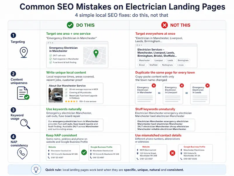
Common SEO Mistakes That Quietly Kill Emergency Page Performance
A few traps catch out almost everyone. Avoid these:
Don't try to target the whole UK with one page. Google won't rank it for any town, and visitors won't trust a national-sounding business for an emergency.
Don't create twenty location pages with the same paragraph and just the town name swapped. Google spots duplicate content instantly, and so do customers.
Don't stuff "emergency electrician [town]" into every sentence. Use it naturally in headings, the intro, and a couple of times in the body. That's plenty.
Don't let your name, address, and phone number differ between your site, Google Business Profile, and Checkatrade. NAP consistency matters more than most electricians realise.
Putting It All Together: A Sample Page Structure You Can Copy
Here's the full layout, top to bottom, that you can hand to a designer or build yourself:
That's the entire page. No pricing calculators, no portfolio of past rewires, no blog feed. Every section either builds trust or drives the call. If you'd like to see how this looks for your specific town and brand, this is exactly the kind of site we build at Nestweb.
Frequently Asked Questions
Do I need a separate landing page for emergency calls, or can I just use my homepage?
A separate page almost always performs better. Your homepage has to serve multiple visitor types, while an emergency landing page is single-minded: get the call. Most electricians see a meaningful jump in mobile calls within the first month of going live with a dedicated page.
How much does it cost to build a website for an emergency electrician in the UK?
It varies widely. A basic template build can start around £400, while a custom, properly optimised emergency landing page typically falls between £1,000 and £3,000. At Nestweb we build SEO-optimised sites for UK small businesses starting from £700, which usually covers everything we've described in this article.
What's the most important element on an emergency electrician landing page?
The sticky mobile call bar, hands down. It's the single change that consistently produces the biggest lift in calls. The hero headline and trust signals come a close second.
How do I get my emergency electrician page to show up on Google?
Combine an optimised landing page (with local keywords, schema markup, and fast load times) with a fully completed Google Business Profile. Reviews and local citations from sites like Checkatrade help reinforce your local presence. For a deeper walkthrough, here's how to get your website on Google properly.
Should I show prices on my emergency electrician website?
Show your callout fee, yes. A clear "From £85 callout, no hidden fees" reassures the customer that they won't be stung. You don't need to list prices for every repair, but transparency on the entry cost reduces hesitation significantly.
Is a contact form enough, or do I really need a click-to-call button?
For emergencies, a click-to-call button is essential. People in a panic don't fill in forms and wait for a callback. They tap, they call, and they speak to a human. A form can sit on the page for non-urgent enquiries, but the phone is the primary conversion path.
Final Thoughts: Your Website Is Either Earning You Calls or Costing You Them
Emergency customers don't browse. They don't read your About page. They call the first site that earns their trust within ten seconds, and they move on from the rest.
Your website is a 24/7 employee. It's either answering the door for every panicked homeowner in your area or politely turning them away towards your competitor. There's no middle ground.
Take ten minutes today and audit your own page. Run through these five questions:
If you answered "no" to any of these, that's where your missing calls are going. Fix those five things and you'll feel the difference in your phone within weeks. If you'd rather skip the trial and error, that's exactly what we do at Nestweb for electricians, with sites starting from £700.
Your next emergency caller is already typing into Google. Make sure they tap your number, not someone else's.